Responsiveness
Does your website look as good on mobile as it does on desktop?
As of April 2023, 58.43% of global site traffic came from mobile phones. Any Buy with Prime experience should scale elegantly within the page, regardless of the device the shopper is using.
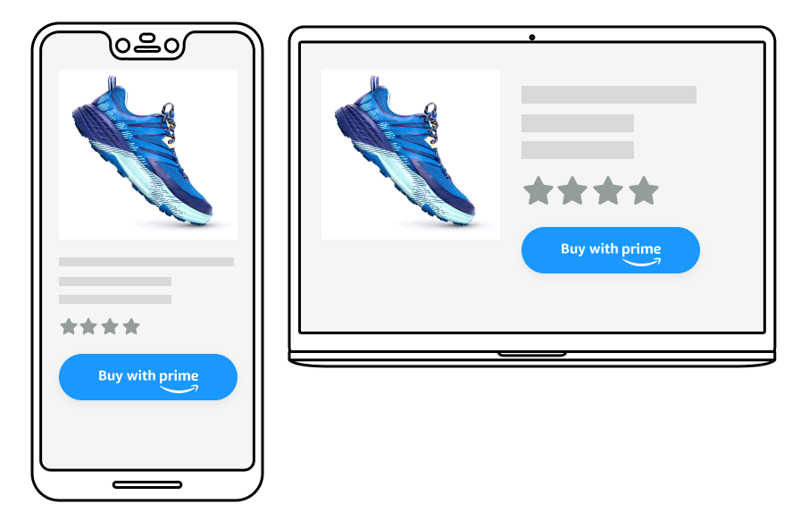
Consider the context the button is placed in
As the width of the real estate increases, elements may shift to more optimally use the space.

Mobile example

Desktop example
Updated almost 2 years ago
What’s Next